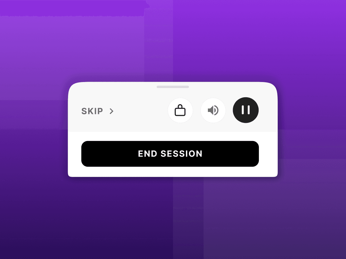
Improving the bottom sheet experience in a guided session
The approach taken to improve skip navigation, resolve ghost touches, and enhance overall visual hierarchy

tl;dr
MY ROLE
I worked as solo UX Designer on this project.
TEAM
Siddhant Agarwal, Dhinesh Ramaswamy, Neha Kaura, Rishikesh Sarangan, Alex Joseph
CONTEXT
The current bottom sheet in Netrin’s guided sessions has significant usability challenges, including a lack of visual hierarchy, overly complex skip options, and issues with ghost touches during activities.
To enhance the user experience, we focused on improving the visual hierarchy to prioritize key actions, simplifying the skip options for easier navigation, and ensuring that users can interact with the app seamlessly.
IMPACT
8%
Reduction in support tickets
